|
by David Shetterly
This is a guide on how to create artwork for officially-licensed merchandise for The Rocky Horror Picture Show. I've created this guide as a "how-to" due to the fact that, over the years, the quality of officially-licensed RHPS merchandise has been in steady decline since the 1990's. RHPS fans, as you might know, are sticklers by nature, myself included. This extends to the merchandise that they buy. With these tips, you should be able to create a quality product that will entice RHPS fans everywhere. This page is broken into five different sections:
1. Colors
2. "Lips" image
3. Fonts
4. Logo Line Spacing
5. The word "The"
1. Colors:
Taken from materials sent to the Fan Club by 20th Century Fox, here is the color for the classic red "blood" lettering:
|
|
RGB - R: 200 • G: 10 • B: 10
Hex - #C80A0A
CMYK - C: 15 • M: 100 • Y:100 • K: 5
|
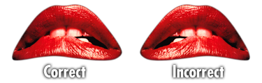
2. "Lips" image:
As far back as 1975, images of the famous 'lips' logo have erroneously been reversed horizontally from the original poster design. Since then, a lot of officially licensed merchandise has copied this design, including the RHPS 3D Light Box (see #3):
3. Fonts:
I've created a special font with embedded RHPS and Shock Treatment logos, for licensed use only by specific entities. A copy of this font is available to such entities upon request. If you would like a copy, send us an e-mail to see if you qualify.
Alternately, and with considerably less accurate results, you can use the "Double Feature" font, available for free on this site.
The "Double Feature" font has been used on many items of official merchandise, including, but not limited to:
• Action figures (Flatt World)
• Trivia game (USAopoly)
• T-shirts, postcards, keychains, stickers, decals, air freshener (Electric Inks)
• RHPS 3D Poster (McFarlane Toys)
• Posters, postcards, matted prints (Import Images of New York)
• Shadowcast documentary on the 35th Anniversary Blu-ray (Trailer Park)
There are also other fonts available:
• "Rocky" (by Astigmatic) is also commonly used
• "Rocky Horror Picture Show" is NOT recommended - In addition to "Double Feature", I created this "experimental" font that ended up being leaked to the Internet. It was used on one official piece of merch - the Rocky Horror Light Box, sold at Spencer Gifts. I recently found a pic of this item on the Internet, and decided to make a few notes...

...If the design was correct, I would have bought this item in a heartbeat. Instead, I was embarassed that my crappy font ended up on the thing.
4. Logo Line Spacing:
When using the words logo, it's best to space the lines so that the "drips" overlap into the text below. Use your own discretion.
5. The word "The":
When re-creating The Rocky Horror Picture Show words logo, it is customary to include the word "The" in the logo. Some merchandise has left out the word, and it looks just plain odd. In contrast, when abbreviating, RHPS is the most commonly used phrase (as opposed to TRHPS).
|
